Redesigning Site Navigation for UT Dallas Students and Faculty
A university website has to serve prospective students and tenured faculty through the same navigation. This redesign found a structure that worked for both, validated across 27 usability sessions.
One website, two completely different jobs to do
This project came through an ArtSci Lab assignment to redesign UT Dallas’s own public website, a large, content-heavy site serving audiences with nothing in common. A prospective student browsing programs and a current student hunting for a financial-aid form were using the same menu, and neither was well served by it. The brief was navigation and information architecture. The actual question underneath it was whether one site could do two opposite jobs at once: help people explore, and help people get in and out fast.
Splitting the audience before touching the navigation
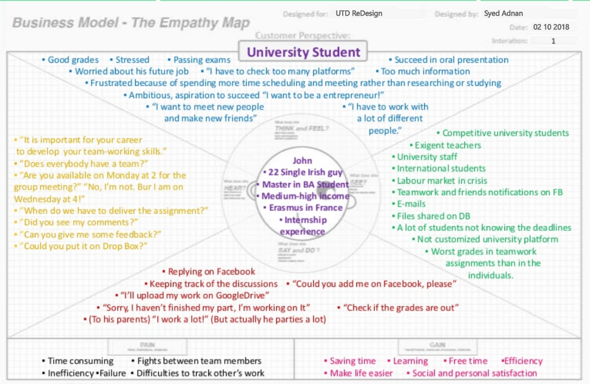
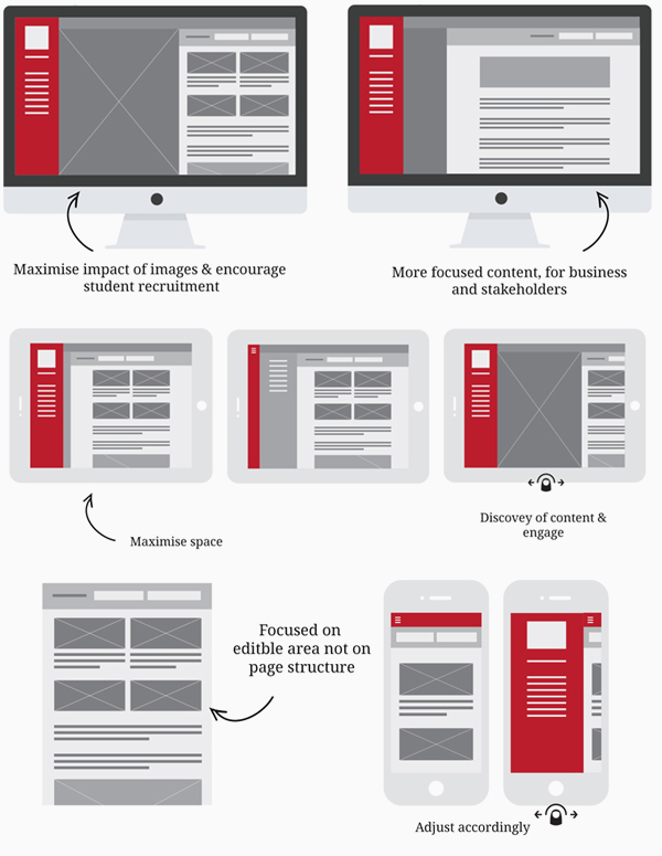
There was no separate design or research track on this. I ran the studies and then took the findings straight into the wireframes and IA myself. I started with empathy workshops to find out what people were actually trying to do on the site. That split the audience into two behavioral modes, Hunters (current students, faculty, staff, arriving with a specific task) and Explorers (prospective students, parents, alumni, browsing generally), which mattered more than any demographic label. I mapped how other university sites handled the same split, then built low- and high-fidelity wireframes and tested them across 27 participants (20 students, 7 faculty/staff), on both mobile and desktop.
88% liked the redesign, but one behavior mattered more than the score
The redesign tested well: 88% of participants rated it highly for ease of use. The more useful finding was underneath that number.
The homepage was still fundamentally pulled between Explorer and Hunter needs, and no single layout satisfied both cleanly. Testing also surfaced something no design review would have caught: several participants defaulted to Google to find campus information instead of using the site's own search.
A navigation system built from what people actually needed
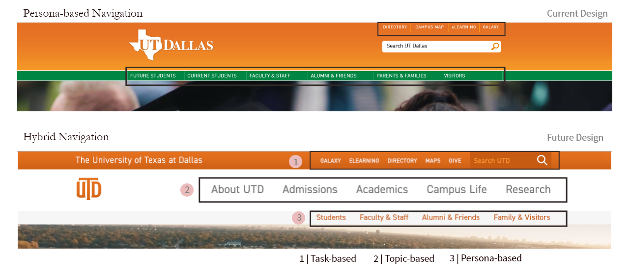
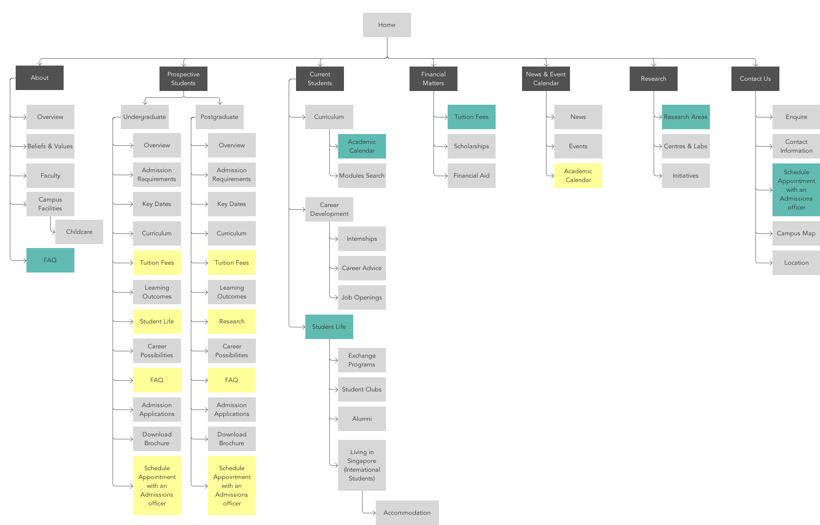
The final design didn’t pick a side. It combined topic-based structure (the pattern most university sites already use) with the persona-based framing the research surfaced, plus a separate task-based bar so Hunters could move fast without wading through Explorer-oriented content. Mega-menus surfaced program information at a glance. And the sitemap itself was rebuilt directly from what usability testing showed people needed, in place of how the university organized itself internally.