Validating Sound as a Data Interface for High-Stakes Monitoring Teams
Could sound convey a dataset as reliably as a chart does? A set of training modules put that question to the test, and the accuracy numbers said yes.
Interfaces barely use sound for anything but alerts
Outside of alarms and notification pings, almost nothing in everyday software uses sound to convey information. That looked like an unexamined assumption rather than a deliberate design decision, so this project asked the direct version of the question: could sound work as a real second channel for reading data, on par with a chart, and could people actually be taught to use it?
Teaching people to “hear” data, one module at a time
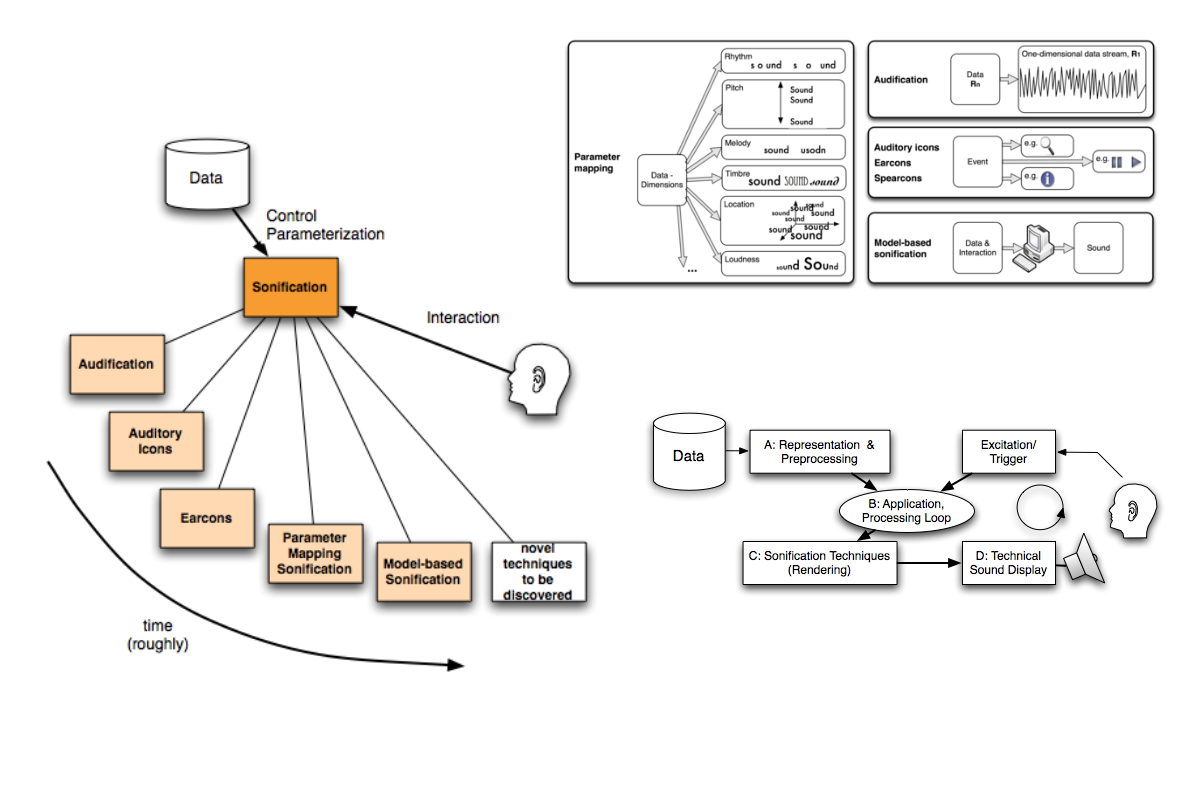
The lab didn’t have a dedicated UX role, so I covered research and interaction design together. Working alongside scientists and developers, I designed a set of “train-explore-test” sonification modules that mapped data to sound in real time, in a stepwise progression from simple to complex. The mappings split into two approaches: model-based sonification, where a listener probes a virtual model directly, and event-based sonification, where changes in data map to changes in sound. I then ran usability studies comparing how accurately people could estimate data values through a traditional graphical display versus an auditory one, including under three different levels of background noise to keep the comparison honest.
Auditory display beat the graphical one, 77% to 95%
For a single-stimulus attention task, accuracy rose from 77% with a graphical display to 95% with an auditory one. That’s a measured result: sound held up as a legitimate data channel in its own right.
The result came with real conditions attached. Performance depended heavily on training and musicality, and auditory display suited slow-changing data with few inflection points far better than fast-changing data. Sound worked best applied selectively, where the data shape called for it, rather than as a blanket replacement for charts.
Adopted as teaching material in two university courses
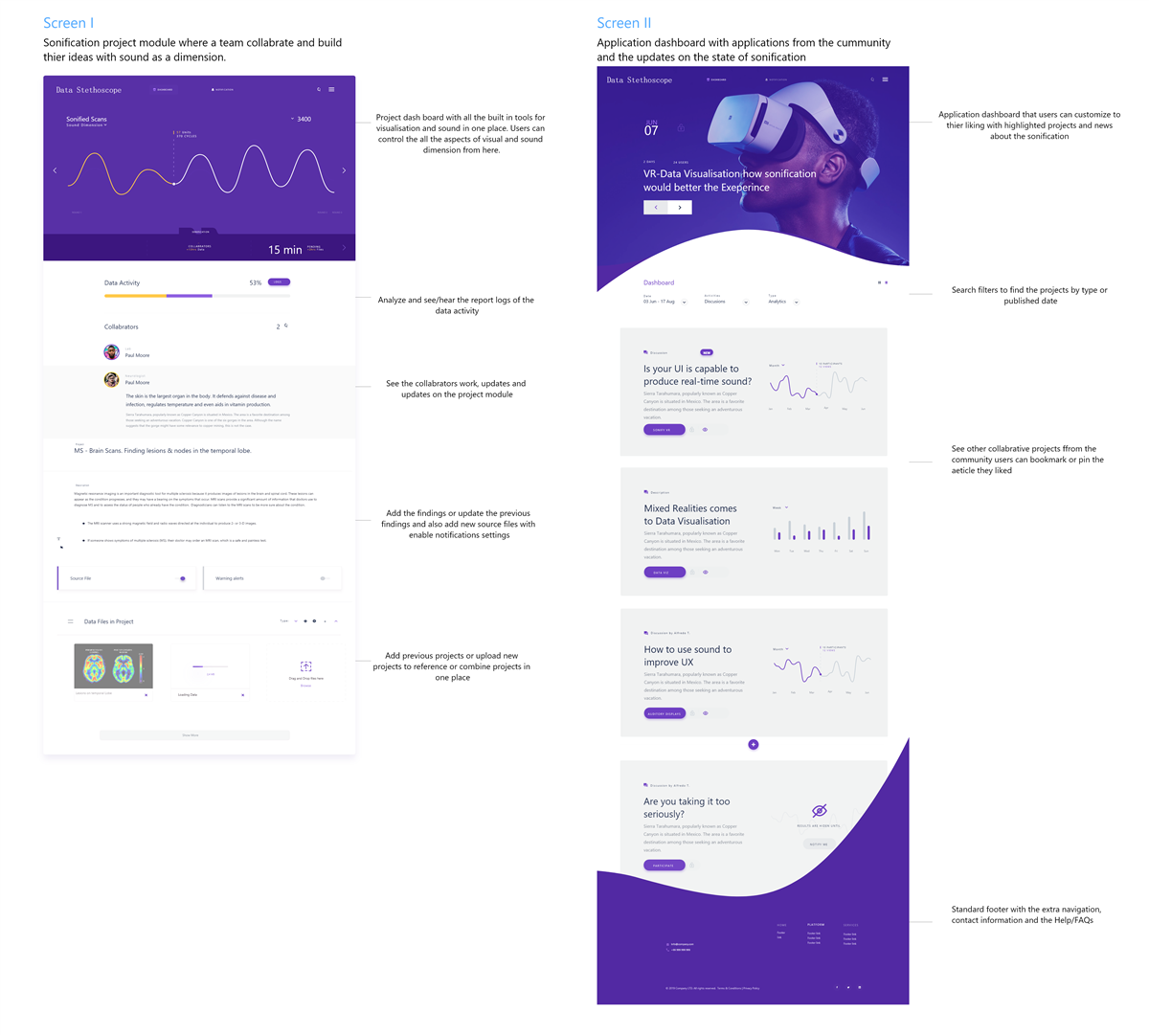
The modules didn’t stay a research artifact. They were adopted as teaching material in both a graduate data-visualization course and an undergraduate interaction-design course. The work also pointed toward an obvious next step: a data tool, in the spirit of Tableau, that would let people apply auditory display to their own datasets instead of only the curated demos built for this study.