The problem
The UT Dallas website is large, complex, content-heavy site that serves incredibly diverse audiences. The task was to improve the navigation menus of the current UT Dallas website and along with information architecture so that users will find what they are looking for without wandering too much.
The Design goal was to build pages in such a way that each visitor leaves the site having found exactly what they were looking for, in a quick and painless way and find out the best way to provide content for student population — perspective, current and international — along with the institution’s staff and faculty as well as alumni, donors, the media, job seekers, and so on, and so on.
My role
I was the User Experience Designer in the team. I worked on this project with UT Dallas Website management team. I organized workshops and usability sessions to gather user’s data and test our assumptions. I also worked with University’s Office of AccessAbility Office to include students with disabilities in the design process and to make it accessible for every user. I conducted usability testing sessions with the target audience and included interaction tools that allowed students with disabilities to interact with the prototype and give their feedback.
Kicking it Off
The primary research’s focus was on users that the website serves and what type of information they come looking for on the website. We identified six user personas among we carectorized them as primary audience and secondary audience groups.
Primary Audience:
Future student | Current student | Faculty | Staff
Secondary Audience:
Parents & Family | Alumni & Friends
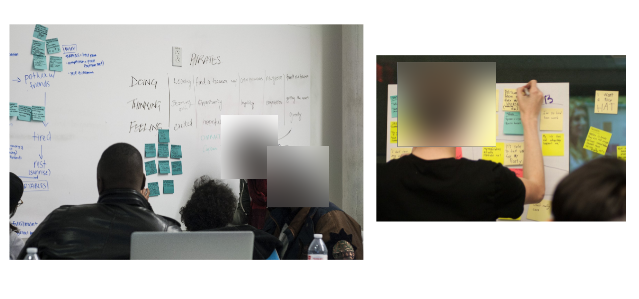
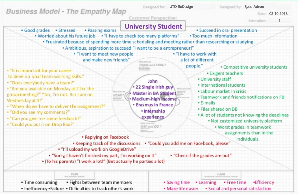
I recruited students and did the empathy exercise with them. Based on the gathered information I divided all of the personas into either 'Hunter' or 'Explore'.
Explorers {Future Student, Parents & Family, and Alumni & Friends}
Hunters {Current Student, Faculty & Staff, and Staff }
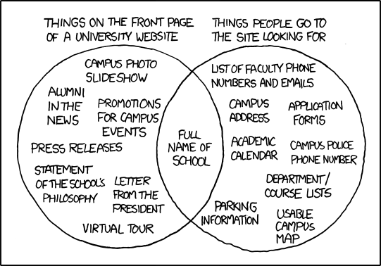
The focus of the home page was on the primary audience if the site tries to be everything to everybody, it will serve no one well. Before embarking on a navigational redesign, the research focus was around these two questions.
What users are trying to accomplish on the website?To make clear the goals of the user we arranged an empathy workshop and invited users to find out the goals of the user. After the workshop made clear distinctions of between the audience as a 'Hunter' or as an Explorer '. Users who got put into hunters would visit the website with a task in mind. These users would navigate the site just that to reach till that information. Users who are explorers would come seeking information of general stuff and would wander around gathering information.
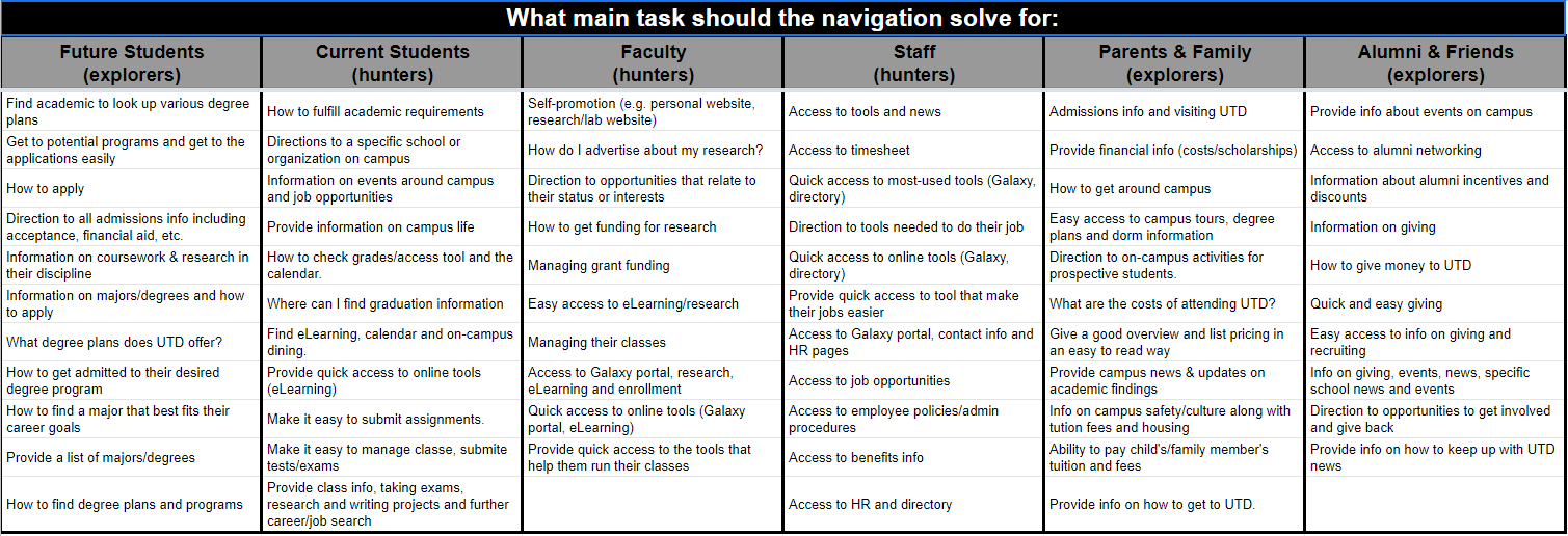
What are user’s key tasks and goal?Before developing a navigation scheme, it’s essential to think through the key tasks for primary audience groups.
Converging on Design
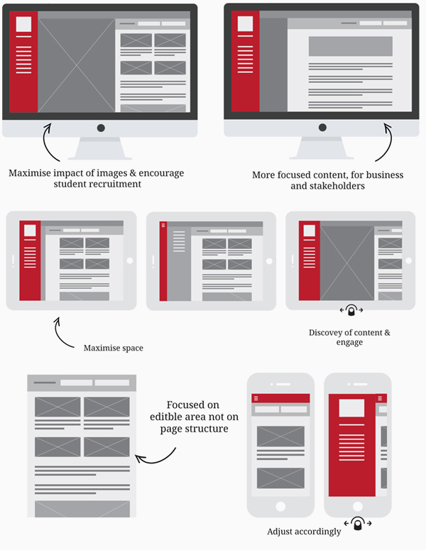
Designed low-fidelity and high-fidelity wireframes to make a layout of the landing page that demonstrated what interface elements will exist. Started working on the visual understanding of a page early in a project to get project team approval before the creative phase gets underway.
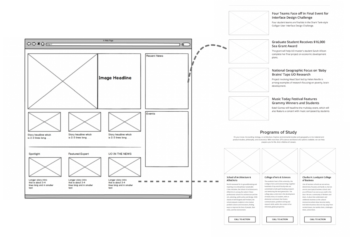
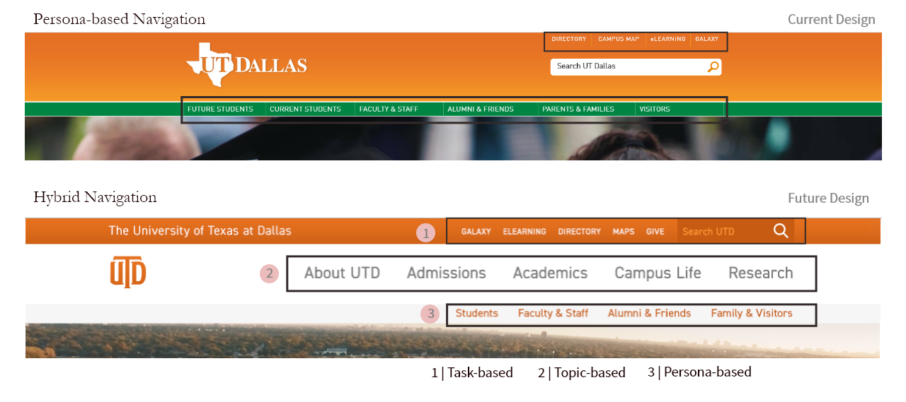
Wireframes can also be used to create global and secondary navigation to ensure the terminology and structure used for the site meets user expectations. The navigation system in the current website does not offer much depth to hunters or explorers.
In the current website, navigation is designed just using the persona-based approach which zeroes in on audiences and tailors the site navigation directly to them. This navigation approach guaranteed visitors won’t be stuck wandering around trying to find what they’re looking for, as the content most relevant to them has been conveniently grouped together. The major problem with the approach is that it just caters to the exploring audience but not all of the users are not on the site to explore.
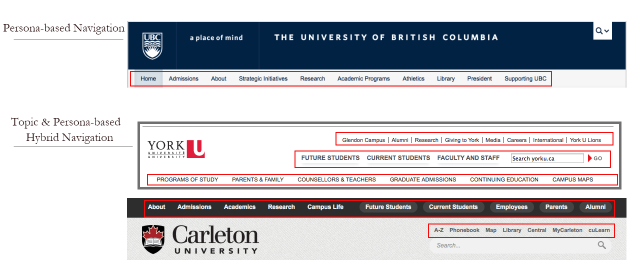
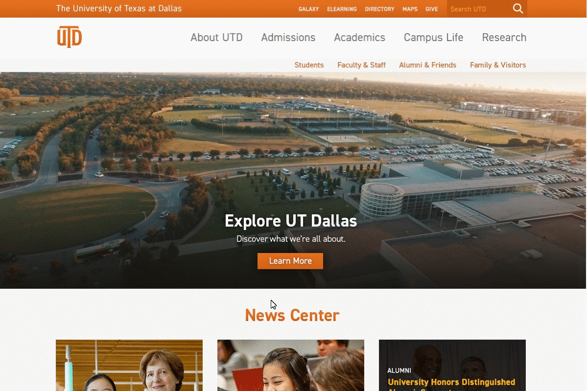
After doing competitor analyses on several university websites the results showed topic-based navigation is more popular among most college or university websites. In the proposed design, I used a hybrid approach between topic-based and persona-based navigation that supports access to key information from across the organization for both 'Hunters' as well as 'Explorers'. I also included a task-based approach which is designed separately at the top which made finding tools faster for 'Hunters'. To showcase the university presence for prospective students and parent’s I added common activities tab (e.g. “review programs,” “book a campus tour”) in the nav-bar.
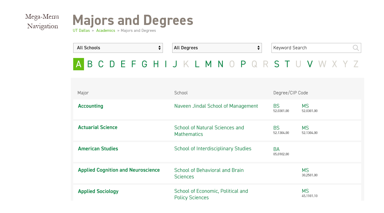
Other than the main navigation bar I also redesigned the currently offered program page. My goal was to provide the visitors with a high-level overview to them without having to dig too deeply into the site. This mega-menus provided a lot of information immediately and helped users jump directly to the most relevant item.
Iterating on the Design
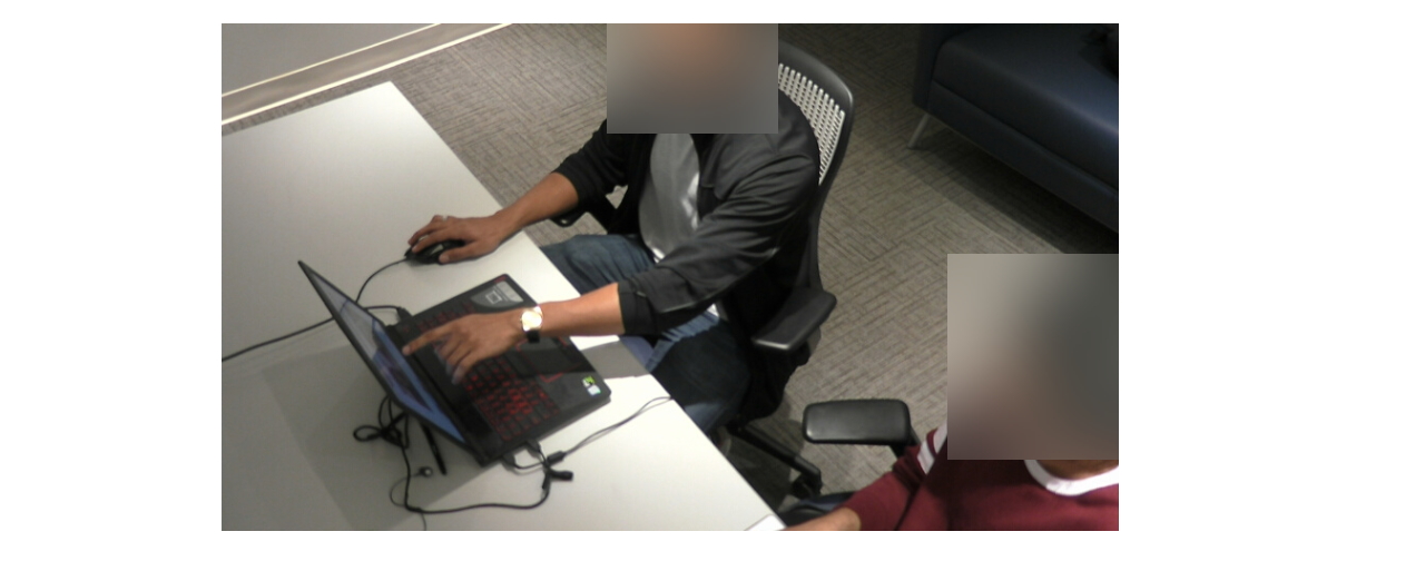
Usability Testing - I conducted the tests with current students, faculty and staff memebrs at the schools Usability Lab. The purpose of the test was to assess the usability of the web interface design, information flow, and information architecture.
20 student attendees and 7 faculty & staff members participated in testing both the prototypes (Mobile & Desktop). Each individual session lasted approximately 35 min. Test scenarios were kept the same over the testing period to keep the same guidelines for everyone and unbiased reports.
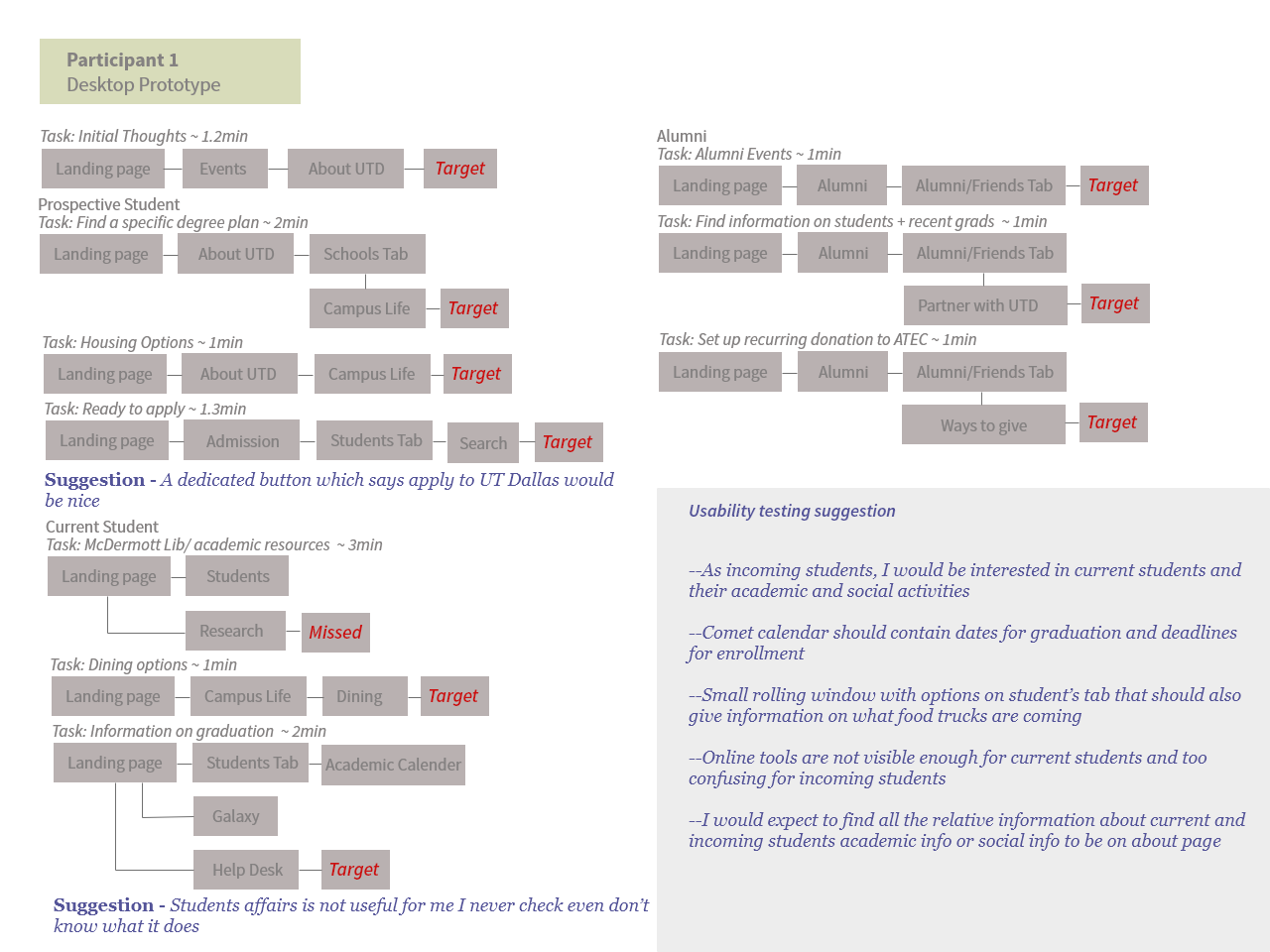
In general, all participants found the new design of the website as clear, straightforward, and feedback survey registered ease of use as high as 88%.
Few participants used google search to find information to school-related information during the testing rather than searching directly on the website. Participants were tested on time on task, task accuracy and completion, and ease of use.
Changing design accordingly
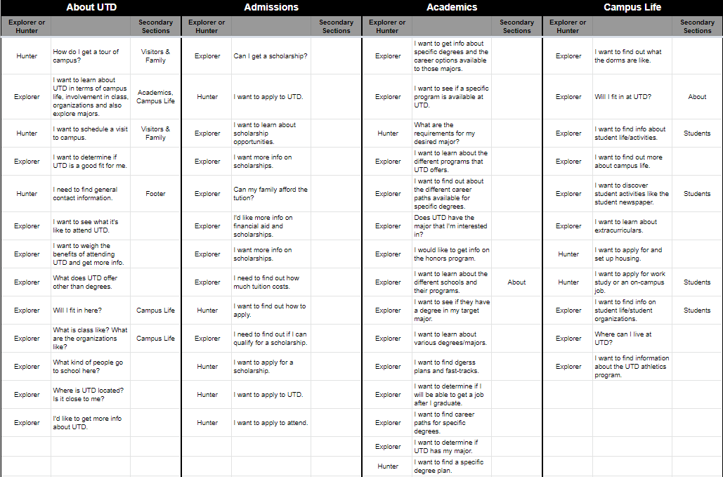
Implementing the suggestions from the user in the design fixed key Information Architecture (IA) problems. The biggest IA problem was with the home page because it was competing for attention primarily for Explorers but had to also cater the Hunters. Usability test results of task accuracy and completion were helpful in figuring out the placement of information. Different personas would look for information in different sections of the site, so it was important to give the same information in multiple places.
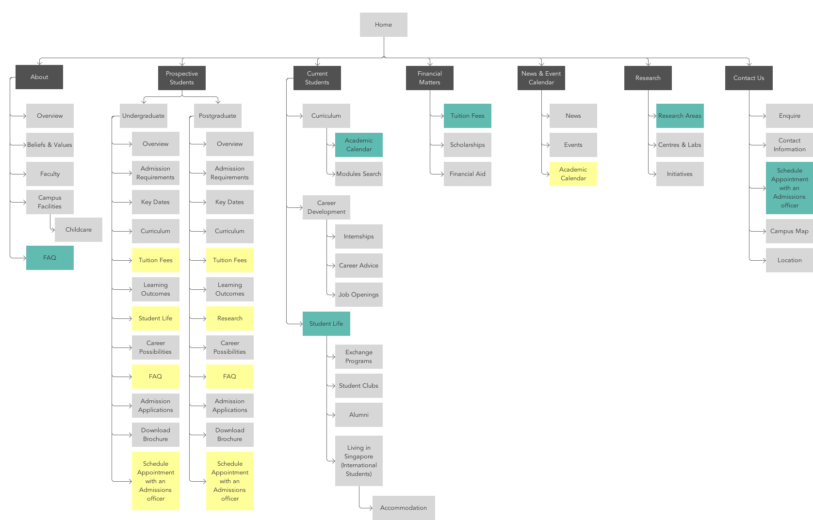
Higher-ed sites are complex, and there are bound to be aspects of the navigation which don’t work as well as hoped. Testing with users helped to catch major issues before going forward with visual designs. After gathering users suggestions I designed new Information Architecture sitemap based solely on the user input. The new IA was focused on speed, convenience and organizational values.
Try Website prototype Try Mobile prototype
Final Design
The final prototype of the website is user-centric and Information Architecture is carefully crafted so that indexing of the information would be uniform for any type of audience.