Charter Communications · Spectrum News app20233 min read
Why Voters Weren't Reaching the Voter Guide in the Spectrum News App
Most people who tried to open the Voter Guide left at the address request. The team blamed privacy. Eight usability sessions pointed somewhere else, and a live test followed.
- 70%
- Left at the address request, per app data
- 8
- Participants, all sessions moderated by me
- 6.1
- Likelihood of entering a home address, out of 7
Role: User Researcher, planned, moderated, analyzed and project-managed the study
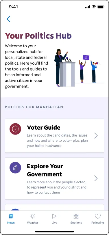
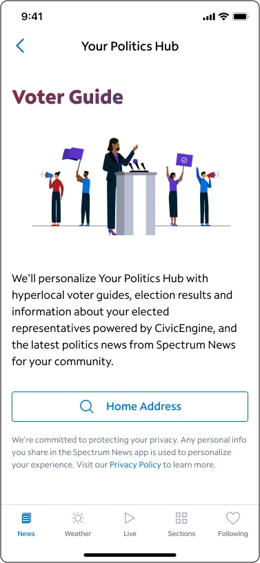
Seven in ten people who got as far as the address request never saw the guide
Politics Hub was the Spectrum News app’s election section, and its Voter Guide was the part meant to help someone plan a ballot. In the previous elections, fewer than 5% of app users ever opened the guide. Of the people who made it to the screen asking for a home address, about 70% turned back or left the app.
The easy explanation was privacy. People don’t like giving an address to a news app, so they back out. That was the working hypothesis, and I wanted to find out whether it was true before we spent a design cycle on it.
Eight people, three political habits, three tasks
I planned and ran this one from start to finish. I wrote the plan, moderated all eight sessions, analyzed them, and turned the results into recommendations the design and development teams could size and schedule. I also managed the project, which meant keeping the design, engineering and analytics people pointed at the same questions.
The participants were eight Spectrum customers aged 27 and over, split across three kinds of political engagement: people who are registered and vote in primaries, people who are registered and don’t, and people who aren’t registered but wanted to get more involved. Each did three tasks in order. First they tried to find somewhere in the app to learn about local politics. Then they looked for voting resources for a given address. Then they reviewed a ballot and planned a vote for one office.
The analytics team and I went through app usage from the 2022 and 2023 elections side by side with the sessions, so each hunch about behavior had a number from real use to check it against.
The address request put people off, and privacy was a minor reason
The sessions turned up three opportunities, and the biggest one overturned the working assumption.
People were leaving at the address request, and privacy was the obvious suspect
People hesitate to give a home address in a news app, so they back out.
Participants had almost no privacy concern. They assumed it would work like a search, and that a local election guide needs an address. The drop-off had another cause: the screen did not show enough value to be worth the extra step.
Test a version that opens the Voter Guide first and asks for the address later, with section titles that explain what the address unlocks.
- 70%Of people who reached the address request, share who never reached the guideapp data
- 6.6Ease of the task, out of 7test
- 6.1Likelihood of entering a home address, out of 7test
The guide put the thing people came for too far down
No fixed view going in. One of the test's goals was simply to find usability concerns in the Voter Guide.
Half of the participants said candidate information was missing when they looked at the page briefly. It was there, under a section called Plan Your Ballot, which did not read as candidates.
Move Plan Your Ballot higher on the page and name it in terms people already use, such as Candidates and Issues.
- Said candidate information seemed missingtest, 4 of 8
- 57%Share of Voter Guide page views that were candidate pagesapp data
Almost nobody found Politics Hub on the first try
The promo cards and widgets were not easy to discover.
That held. Participants reached for the wrong doors, including a different politics widget and the profile icon. They still wanted the feature: every one said they would use it for their next election.
Author the promo card higher and the Politics widget first during elections, author year-round, add an entry for out-of-market users, and consider a permanent Politics item in the main navigation.
- Chose Politics Hub first, without confusiontest, 2 of 7
- Expected a different politics entry insteadtest, 4 of 7
- Said they would use it next electiontest, 8 of 8
- <5%App users who viewed the Voter Guide in earlier electionsapp data
“The resources are more important than the polling location. Move that up to the top of the screen.”
“Maybe retitle Plan Your Ballot to Candidates and Issues.”
“I would also hope this would carry on, not just during the presidential election.”
People who dropped out weren’t protecting their address. They were deciding the screen hadn’t shown them enough to be worth another step, even though they said the guide was something they wanted once they got there.
Two smaller things came up that sat outside the three tasks. About a third of participants named election features from other news apps that this one lacked, interactive results maps above all. And the app data showed that push notifications drove 28% of Voter Guide visits, behind organic visits at 56% and ahead of deep links at 16%, with some markets leaning on notifications far more than others.
Eight sessions can show why people hesitate and what they expect. They can’t say how many people will behave a given way, which is why the address question went to a live test and not straight to a redesign.
The version that opened the guide first did better, and the guide changed
I turned the recommendations into two phases and sized each one by design and development effort, so the team could see which were small, which were medium and what could ship first.
The first phase shipped. Candidate information moved higher on the Voter Guide, the section was renamed in plain terms, and the promo card and home widget were rewritten to show what the guide offered. The team also ran an A/B test of the new address flow against the existing one. The version that opened the guide first did better, with about 30% more eyes on the guide than the version it was tested against, and the team used that result to change the Voter Guide.
The second phase was the longer list from the study, including interactive election-results maps and a place in the main navigation. Both were slated for the next iteration, ahead of the next election.
What changed the team’s mind about privacy was the combination of the 6.1 out of 7 score and clips from the sessions, where participants willingly entered an address once they could see what it was for. That turned an assumption nobody could fix into a problem the team could test.